I ran an A/B test to see if I could increase the conversion rate for the email sign up call to action on BeFused.com. The call to action is positioned at the bottom of each blog post.
What is an A/B test?
An A/B test is an experiment in which two variations, known as A and B, are tested against each other to see which one converts best. The tests are controlled in that everything else on the page remains the same. The two variations are changed dynamically over a period of time. Version A is often referred to as the control and version B the variation.
Let’s have a look at the two calls to action.
The Control (Version A) - image call to action
In this test, the control was an image based call to action. When the user clicked on the image, they would be presented with a modal popup where they can enter their email address to receive the Drupal Toolkit.

The Variation (Version B) - text based call to action
The variation was a text based call to action. When the user clicked on the blue button, they would be presented with the modal popup to enter their email address to receive the Drupal Toolkit.

The result
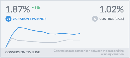
The variation B won by a decent margin. This might seem counter intuitive because the control stands out much more and looks nicer because it is an image. However, the result is what I expected. Call to actions that stand out too much, especially those at the end of articles, don’t necessarily convert the best. People are used to tuning out external adverts and an image based call to action that looks a lot like an external advert. A text based call to action, like the variation in this test, blends into the article and therefore people are more likely to read it along with the rest of the article. In addition, by nature of it being text based, more information about the benefits of the Drupal Toolkit were included.
The increase in conversions was a sizeable 84%.

The variation B actually won within a few days with a 215% increase in conversion.

There was 95% confidence in the result, so I could have ended the test there and then. But I decided to run the test for a longer period just to see if the conversion rate would change. The conversion rate for the variation fell back somewhat from its peak but was still at a higher rate than the control throughout the test.

Lessons learned
The main lesson is that results from real world tests are often counter intuitive. One cannot simply use a design only approach and go with what looks nicest. What looks best isn’t necessarily what is best for business results - this can only be achieved through testing and continuous optimisation.