How do I style the Drip confirmation link?
I recently received the following question from a reader:
How do I style the confirmation link in the confirmation email? I’d like to style it as a CTA button.
By default in Drip, the link in confirmation emails is a standard link with no styling at all. Styling this as a button will make it stand out and make it obvious that the new subscriber should click on it if they want to confirm their subscription. This could increase the proportion of people who confirm.
Confirmation emails in campaigns
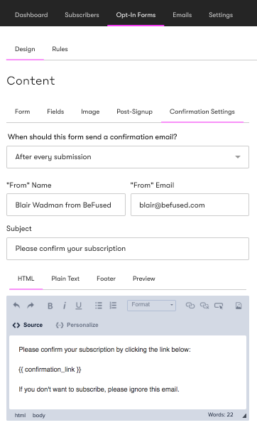
Confirmation emails are sent to new subscribers when they are added to a campaign. To see the confirmation email, head to the Opt-In Forms tab in your campaign and then Confirmation Settings.

You’ll see the confirmation link inside a special tag:
{{ confirmation_link }}
This tag is using Liquid, which is the templating engine that Drip uses. In Liquid, the double curly brace means some data will be inserted inside them. In this case, the confirmation link.
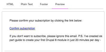
Click on the Preview tab to see how this will look after it is sent to new subscribers.

As you can see, there is no styling on the link.
Drip’s built in button style
Drip does come with a built in style for a Call to Action button that can easily be added to emails in broadcasts, workflows and campaigns with just one click of a button (see Drip’s knowledge base for more information). However, the easy option to add the Call to Action button style does not exist for confirmation emails.
But there is a way around this! All you need to do is manually add a CSS class to the link by following these steps:
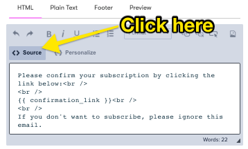
Go back to the HTML tab in the confirmation email and click on the source button.

Remove {{ confirmation_link }} and add the following in its place:
<a class="cta-button" href="{{ confirmation_url }}">Please confirm subscription</a>
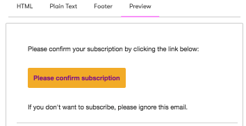
To see how it looks, go back to the preview tab.

And that’s all there is to it! You can now turn all of your campaign confirmation links into styled call to action buttons.